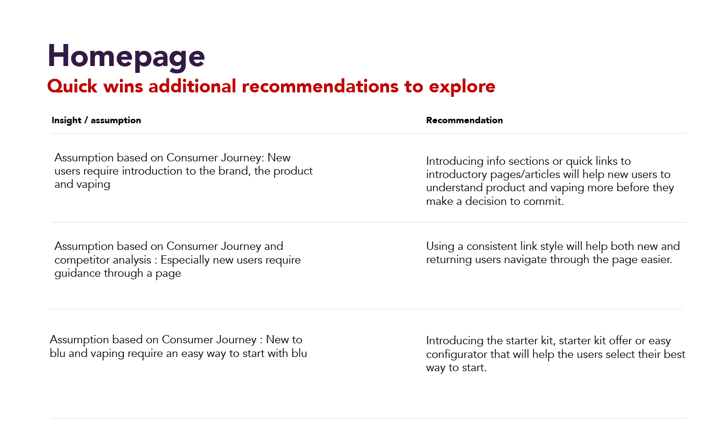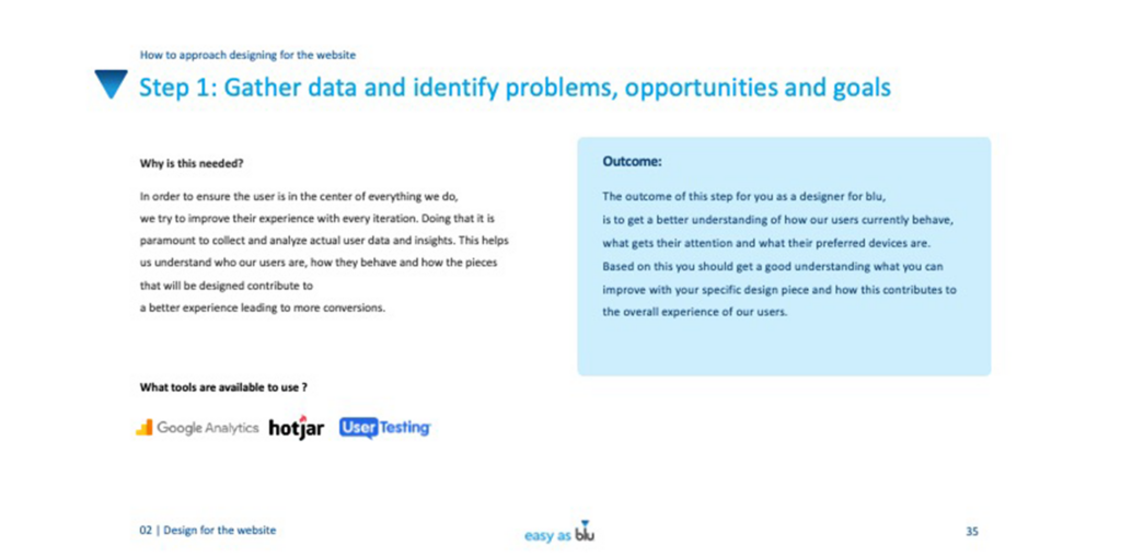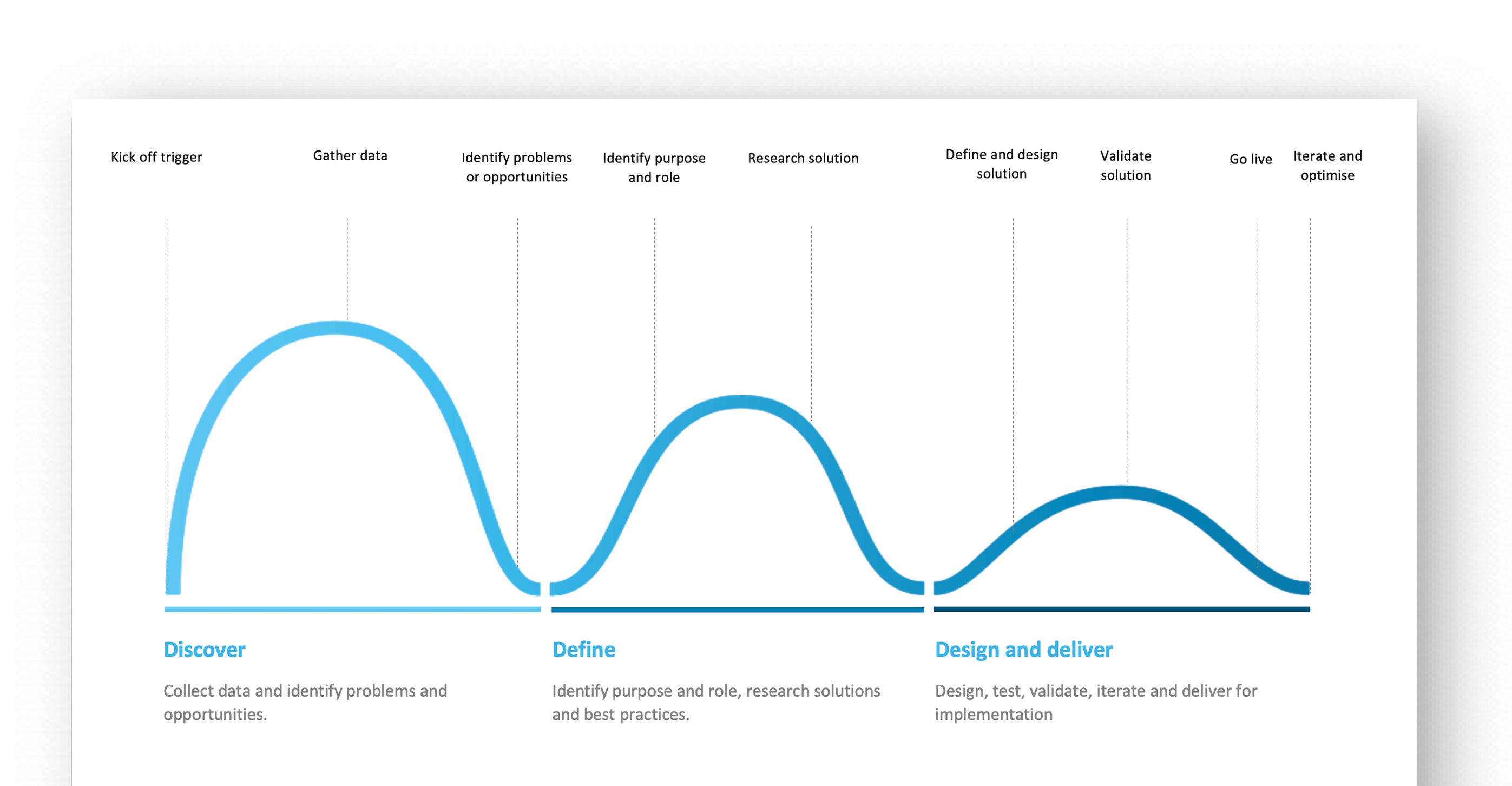
UX Audit
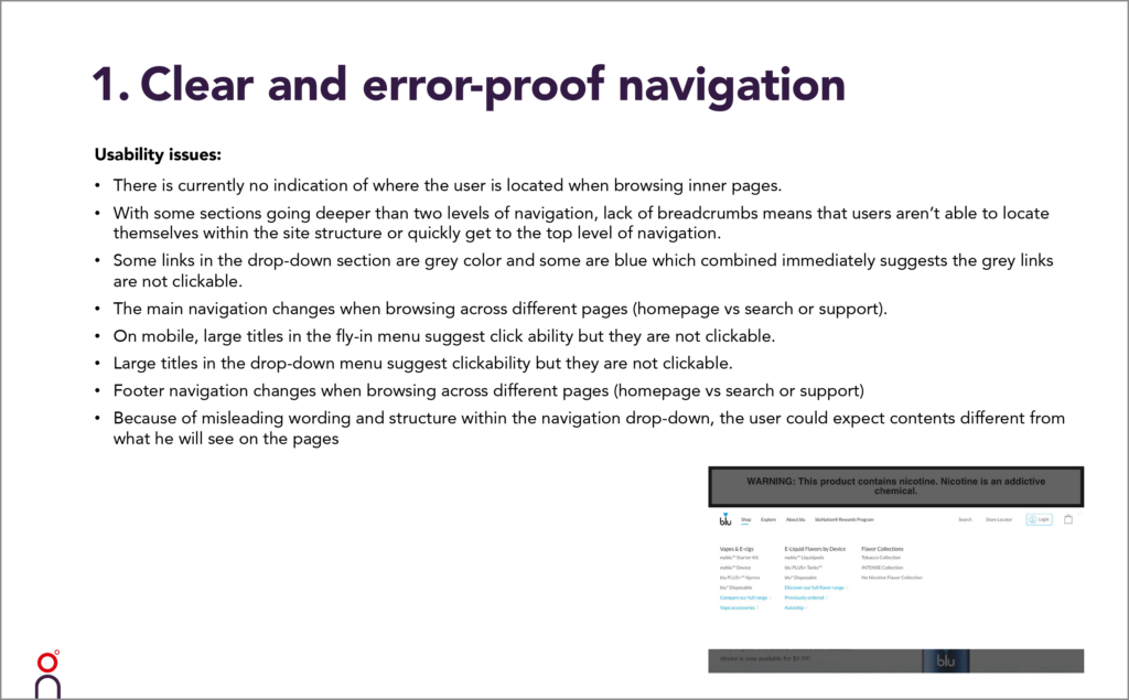
To assess the user experience on the website and establish where challenges and room for improvement existed we conducted a formal UX audit based on Jakob Nielson's UX heuristics. Furthermore we did a page by page audit to uncover the current ux & usability flaws.
Tech/Seo Audit
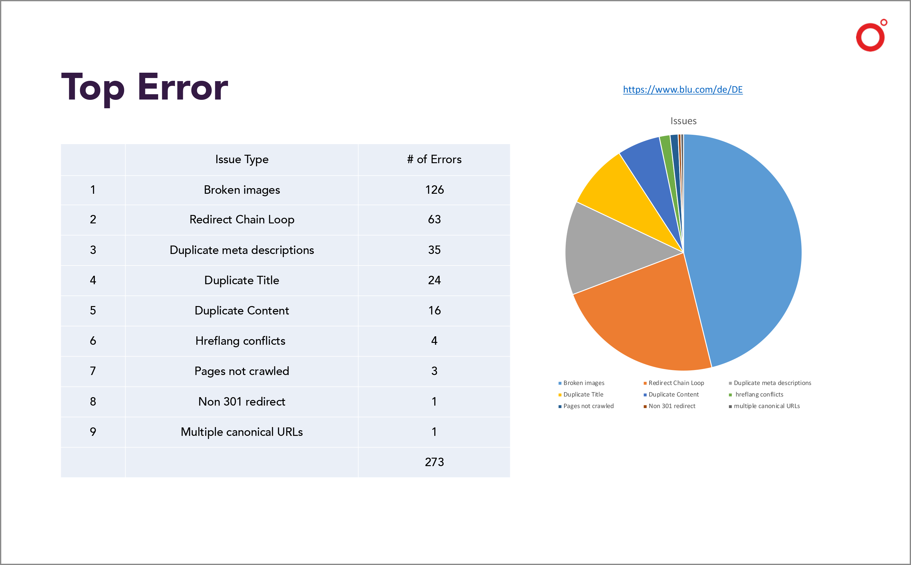
With the help of the tech team we conducted a Tech & Seo Audit of the website. This included the audit of conflicts like duplicate content and the intended name change of one of the products as well as an analysis of Web Analytics , user flows and hotjar metrics.
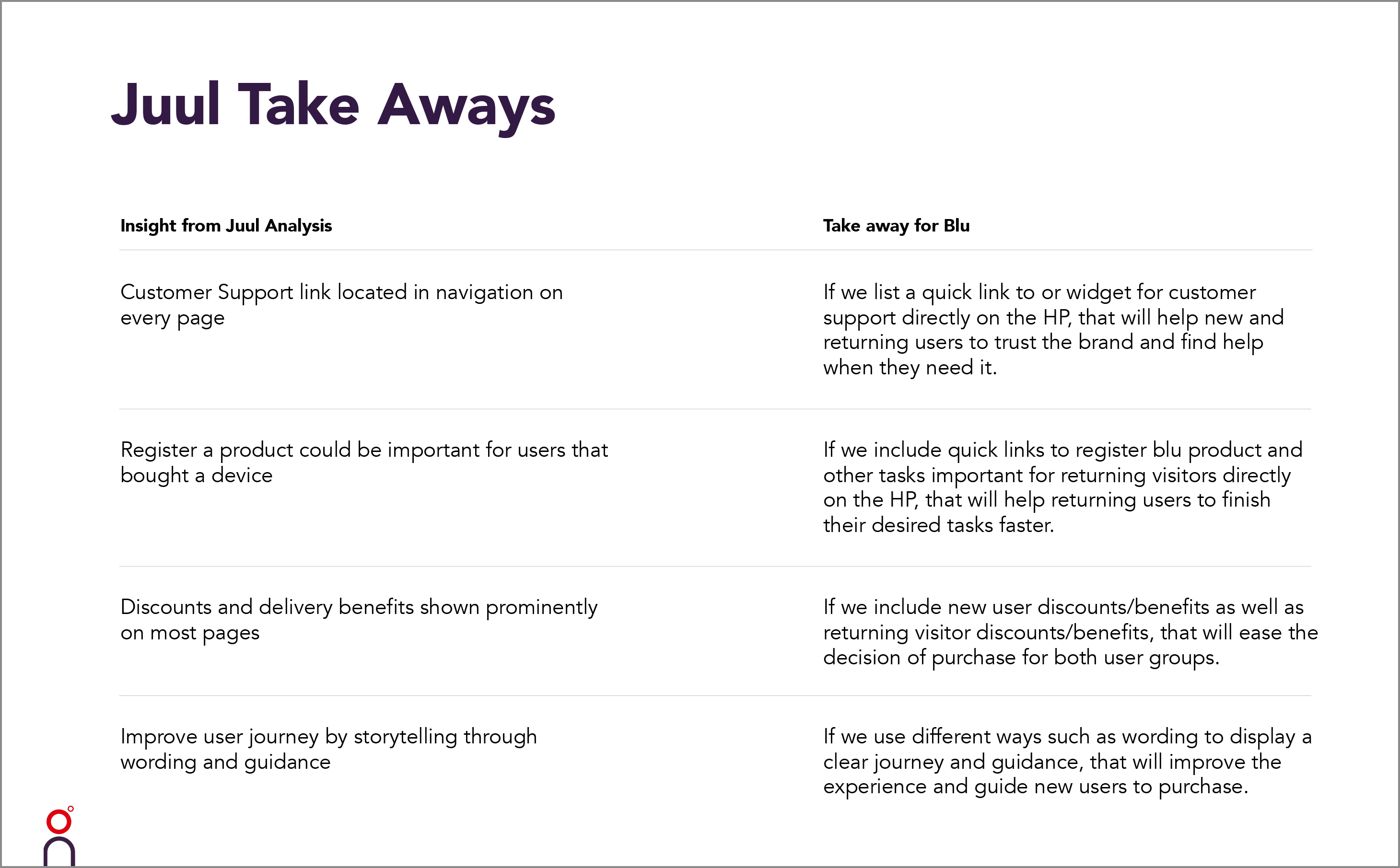
Competitor analysis
We analyzed the competitors websites to understand their strategies and how they handle the segments restrictions. We focused on the functionalities, messaging, visual cues and general appearance.