Volvo Dealer App Relaunch

Technical discoveries made clear that the current app code needs to be overhauled, which is why Volvo were looking to re-introduce the Volvo Dealer mobile app to all Australian dealers.

Go directly to:

01_Volvo_Keyvisual

Volvo Dealer
App Relaunch

Technical discoveries made clear that the current app code needs to be overhauled, which is why Volvo were looking to re-introduce the Volvo Dealer mobile app to all Australian dealers.

More than just an update.

Making a product useful by adding more value.

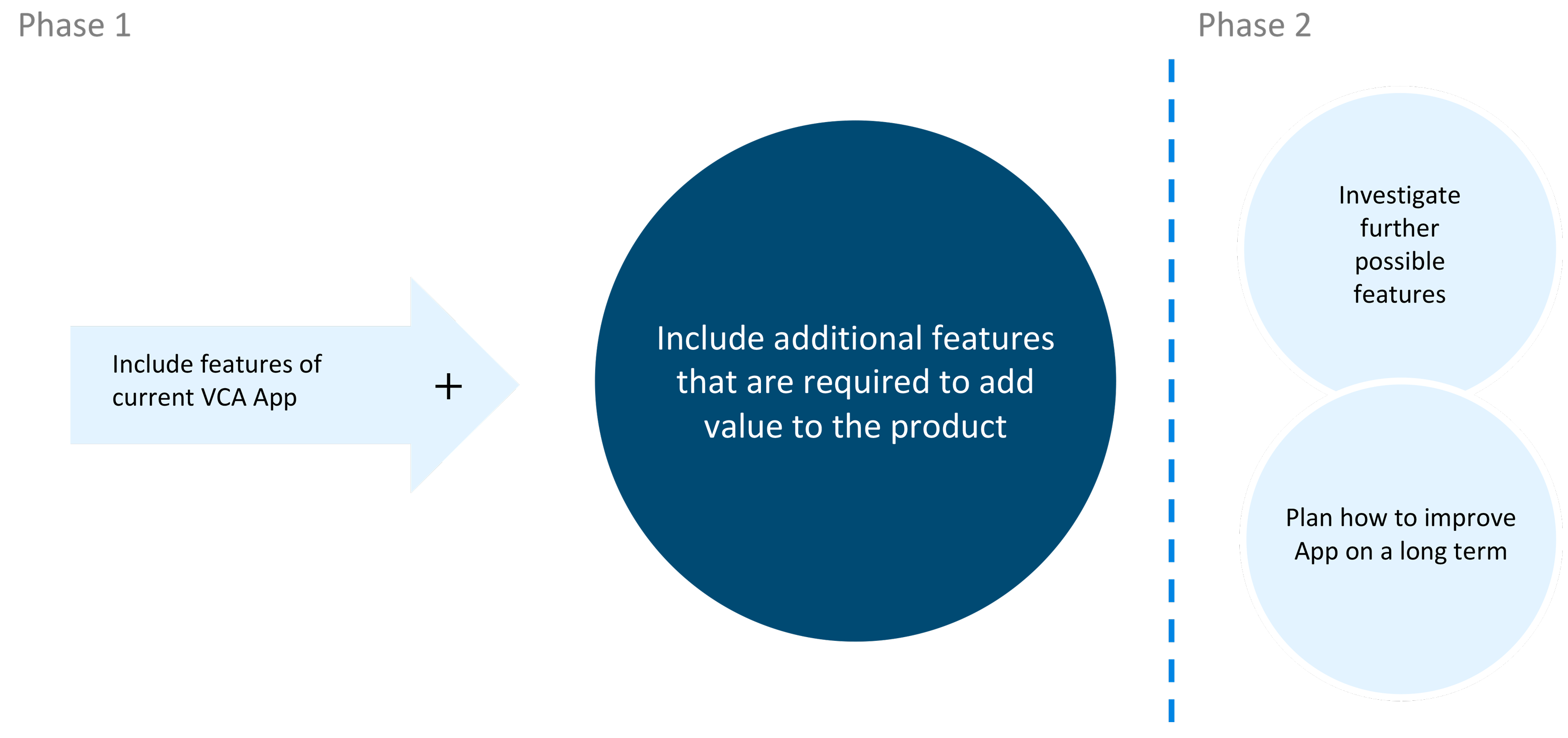
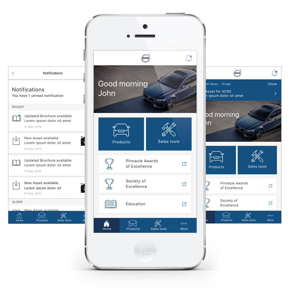
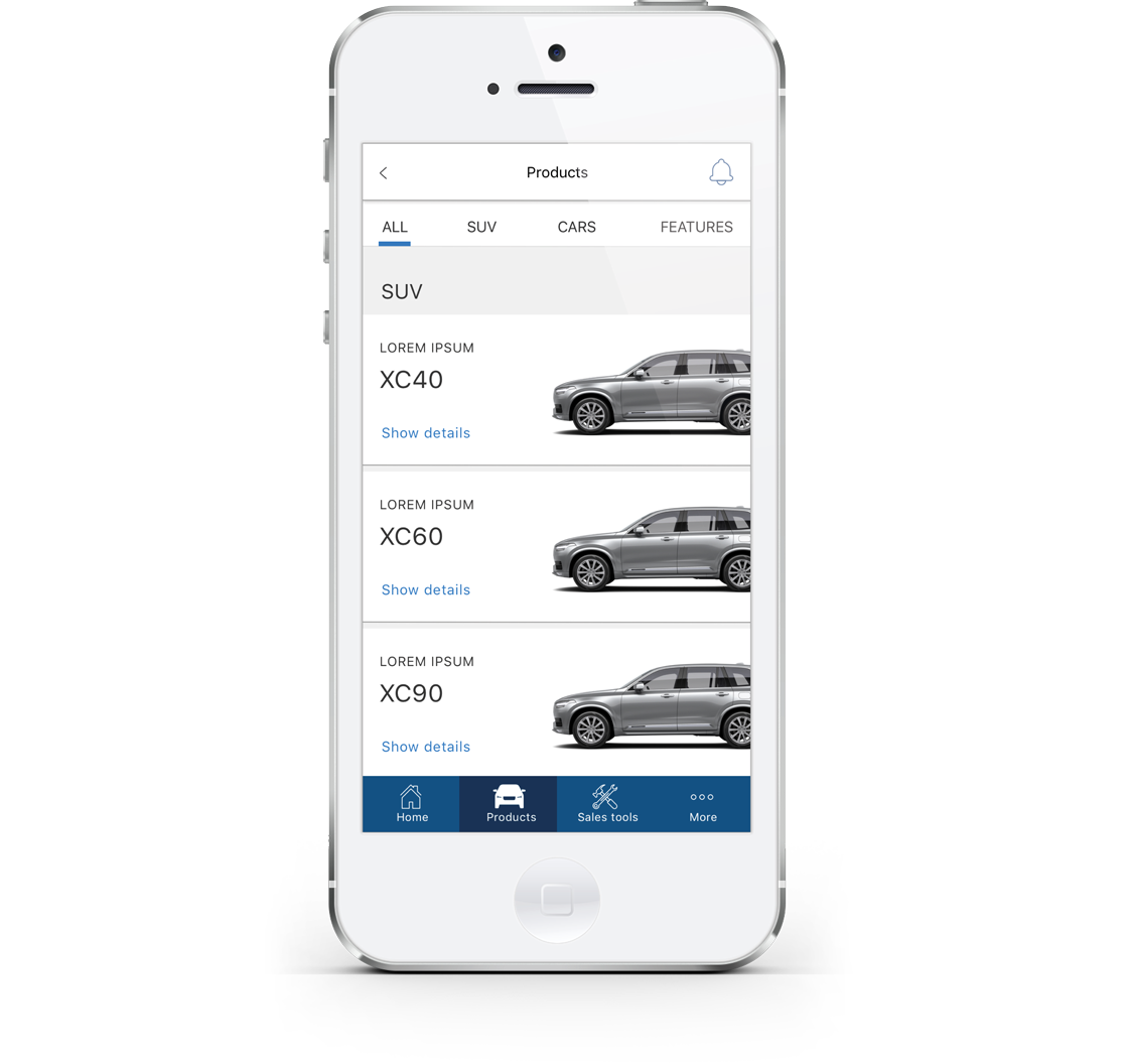
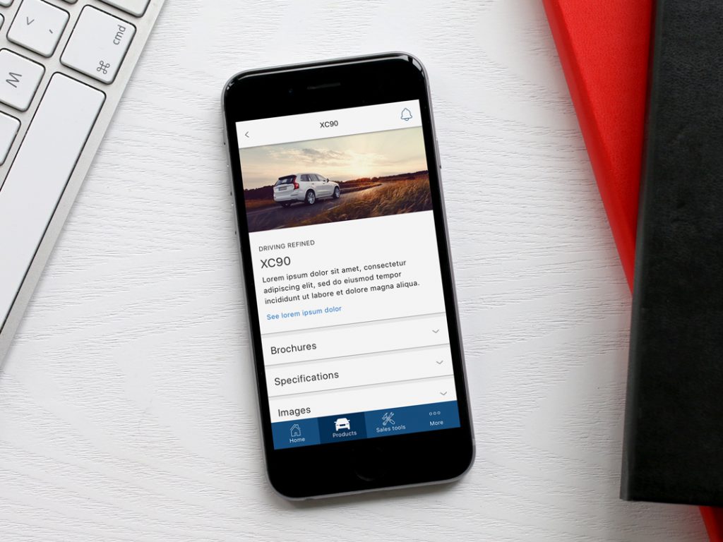
As the Volvo dealer app (VCA) did not live up to today’s standards and coudn’t be updated due to conflicts with the framework a relaunch was intended. The main goal for this project was to create a new release of the app to the Apple and Android stores that included the latest content and added more value for Volvo dealers.

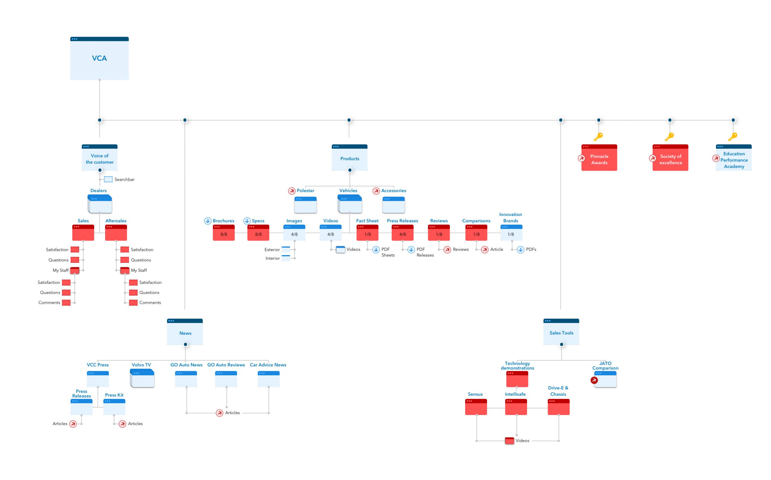
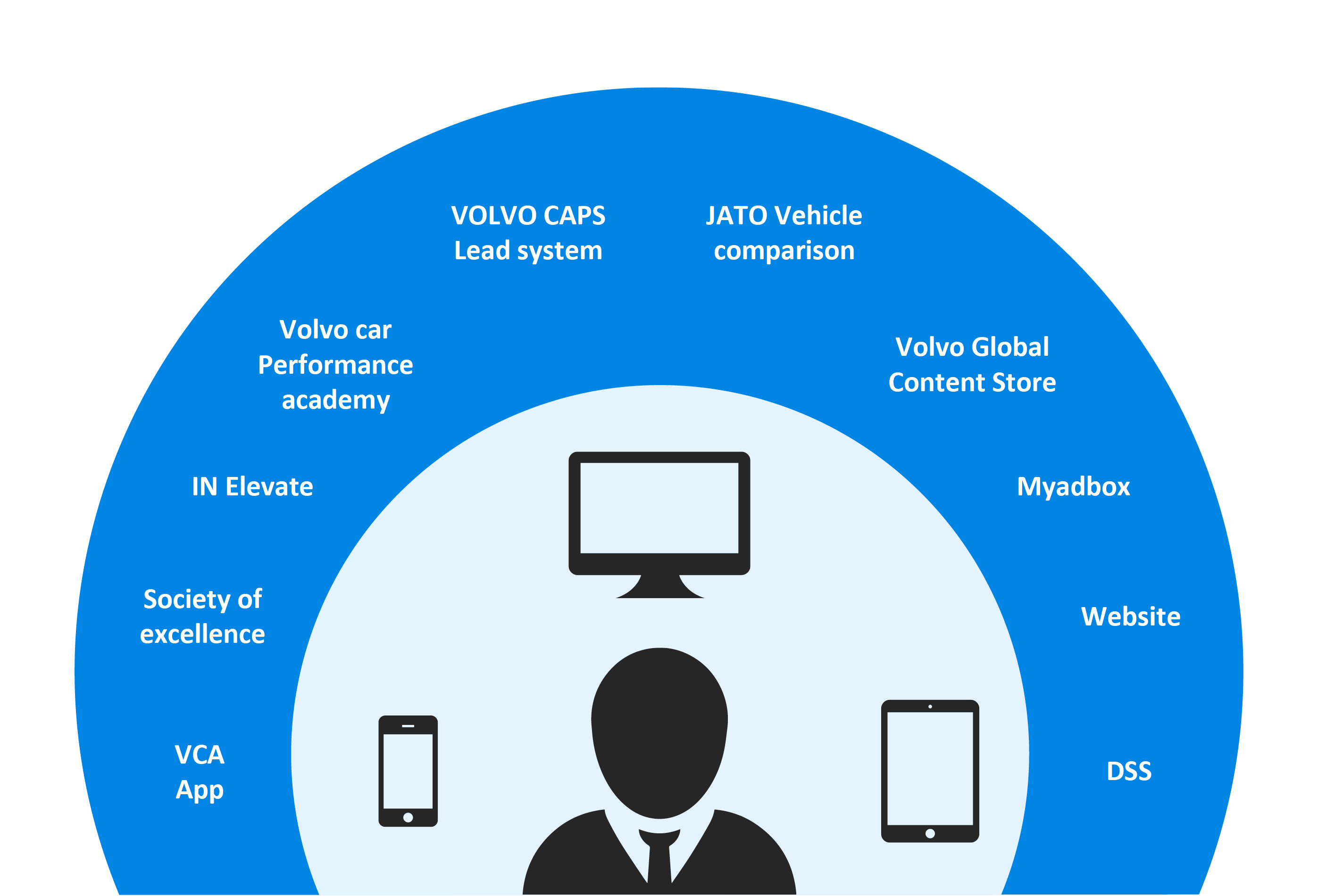
whiteGREY approached this project through running a discovery phase of the current VCA version and the current dealers’ digital eco system. This included the research of VCA’s current IA and contents and how they are connected to other platforms within the digital eco system. To determine goals, expectations and user needs for the app relaunch, whiteGREY created a questionnaire and held stakeholder interviews as well as several dealer interviews.

Client

Volvo Cars Australia
Whitegrey Austraila

Role

Lead UX & UI designer in a team with Chief CX officer and Project managers

Deliverables

New Volvo Dealer App, Future plan for new features

Timeline

Approx. 2 months & improvement plan on a long term

Our approach.

What do we need to do in order to create a better product.

Before we could jump into the project, a plan was mapped out to gain a better understanding of what needs to be done. During discovery phase the current system its’ platforms and their connections were investigated and analzed. Analyzing usability flaws of the current app, was also a big part of understanding what needs to be done to make the product better. With the creation of questionnaires, we were able to carry out Stakeholder interviews as well as User interviews. With all the information gathered, an outcome analysis followed by a strategy were created.

Interviewing the users.

Carrying out interviews with the apps’ target group – the Volvo dealers – helped us to understand the user needs and pain points. First of all we interviewed stakeholders, to understand their goal with the product as well as what they want to learn from the user interviews. From their desires and also from our intention to conduct user interviews, we determined the main goal and created a questionnaire. While carrying out the user interviews, the questionnaire was evolved on the go, because every interview brought some new insights, we wanted to further investigate. Afterwards we summarized and analyzed the answers and shared them with the client.

Limitations and pain points.

A further look into the content and the overall system.

To get an overview of all contents, pages and their connections a sitemap was created. It displays downloads, links, log-ins and contents. During the dealer interviews we learned, that a lot of content within the app is not updated. This is why we had a look at every single element and created a second sitemap. We shared this with the client, to show some of the main pain points – content that is not updated, a lot of links to other platforms and several log-ins.

Dealers’ digital platform system.

Furthermore we looked at all Volvo applications, used by Volvo dealers. Some of them are within the VCA, but only as a link to the actual platform and others are platforms without any connections to VCA. It was obvious that dealers had to use way too many platforms on different devices. This brought us to the next pain point, that was also mentioned during our interviews – For everything a dealer needs to do there are different tools he needs to use. This is not only user-unfriendly but also hard to manage to update every single application.

Find solutions to problems.

The solutions to key findings and pain points from our research.

With the insights of our research and interviews, we were able to specify the issues of the app’s usability and usefulness and to find solutions for it. The most important and obvious solution, was to integrate instant updates and to implement notifications for updated and new contents. Others you will find below.

Overall platform

Daily usage

Community

Rethink the project

We suggested a two-step-relaunch. With the first release we will achieve the early go to market date, which will make the app more user-friendly but won’t add any value. With the second release we ensured we are rethinking the concept and create a platform with features that add a value to the product.

Design redefined.

The screens of Design Phase 1.

Core functionality available with one tap

The overall design was adjusted to fit Volvo’s current style. With future features in mind the Tab navigation was introduced. In the second phase of design, a personalization option should be added, so that a dealer can add the screens to the navigation, that are most important to his daily business. Furthermore a Notification system was added to let users know about updates within the app and within other platforms they use. The home screen will also be adjusted with more information.

Displaying heterogeneous content with cards

The product page was also designed with the Volvo style in mind, adding a product shot, the cars tagline and the top tap navigation to filter the results. We chose to set it up with cards, whose style could be reused throughout the app.

Details in sections

The card’s style was adapted to design the product detail page and its accordion menu. All needed information are shown within the page, which gives the user a better overview of all contents instead of going from one screen to another to find what he is looking for.

Styleguide

To make it easier for development an additional styleguide was created. It includes all elements that were used, their spacing and look.

The big picture.

Rethinking the concept of the VCA App.

Within the discovery we already found out what kind of features are required to add more value and which we should investigate to create an overall useful product. Therefor the app was created with the bigger picture in mind. We came to the conclusion that a progressive web app would be the perfect choice to achieve a connection of different platforms, accessibility from any device and easy manageability.

Features to include in Phase 2

We listened to the App’s users and summarized required features that should be investigated and designed for the second phase of relaunch.