TROAD TRAVEL APP
Individualize traveling –
No time to waste. Walk off the beaten path by connecting with locals and travelers and let
amazing moments happen.
Developing an experience.
The Idea behind Troad and its possibilities.
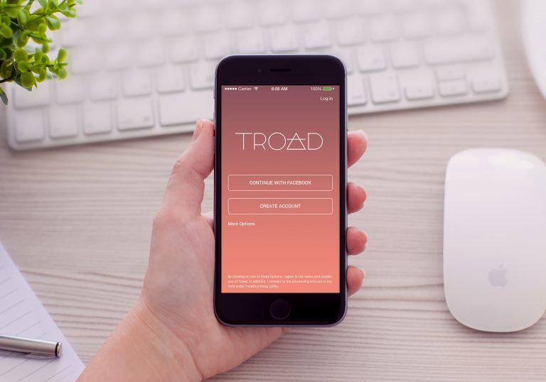
Troad is a mobile application which helps to individualize and to intensify travelers journeys. Travelers don‘t want to be tourists that walk on beaten paths. Therefor Troad builds a two-sided platform, with a network of like-minded people as well as a service platform that let‘s you see the world through the eyes of a local by booking authentic experiences.
In order to create a useful product I looked into the history of traveling, intercultural communication and the intention behind individualized travels. So the problem this app had to solve was to overcome the gap between modern traveling with smartphones and the oldfashioned way of traveling and talking with complete strangers met along the way.
Client
Bachelorthesis TROAD
Role
Worked on my own From research to marketing
Deliverables
380 pages Bachelorthesis Axure Prototype
Timeline
Approx. 2 months
Back to the roots.
Having a look into
the nature of traveling.
Traveling is not a modern phenomenon that has opened up in recent centuries, but goes way back in history. Due to the lack of all the electronic gadgets, whe have today, travelers and locals were much closer.
In today’s society, the interest in the new and the unknown is growing and interests are becoming more specific. People don’t want to walk on beaten paths, but dig deeper into the culture and people living there. The trend of individuality in the context of connectivity unfolds and is gaining ever greater social significance.
Troad application in the german design press.
I am extremely pleased that two of germanys leading professional design magazines took the time to dig into my project and publish an article about my bachelor thesis and the resulting Troad App. The articles were published within their online presence as well as in their printed magazines.
Discovering the needs.
The Problems and
challenges I faced.
Besides the usual goals every product should achieve I broke down the problem into three key objectives. These „how might I“ questions drove my exploration with different types of analyses like User Journeys, Story Mappings and the clarification of target groups.
Online vs. Offline
Since the digital media is known to suppress social contact rather than promoting it, the main problem was to connect online and offline communication. To achieve this a Meetups section, a chat and a network were added. Furthermore users can use this app to interact with eachother on and offline.
Encourage users
While creating an appealing look it was important to add value. The app offers people to earn money with their skills, time and their commercial services as well as getting to know other people. For travelers, the added value consists of flexible, cheaper and, above all, more authentic travel experiences.
Everyone and Everywhere
Because of different personalities, each with their own needs, an app had to be created in which all user groups can act and be brought together. Surveys and Personas identified the needs that led to the concept of a two-sided platform including various areas, interest queries and filtering capabilities.
Research and surveys.
Surveyed were 100 men and women between the age of 18 and 50 +. The survey has specifically taken place in individual travel forums to find out what this target group needs from an application like this. Every need was analysed and implemented.
90 %
want to see & write reviews
70 %
want to see & write reviews
Cultural Deep Dive
Within an online survey different questions such as „Would you like to dive deeper into other cultures and meet locals?‘ were asked.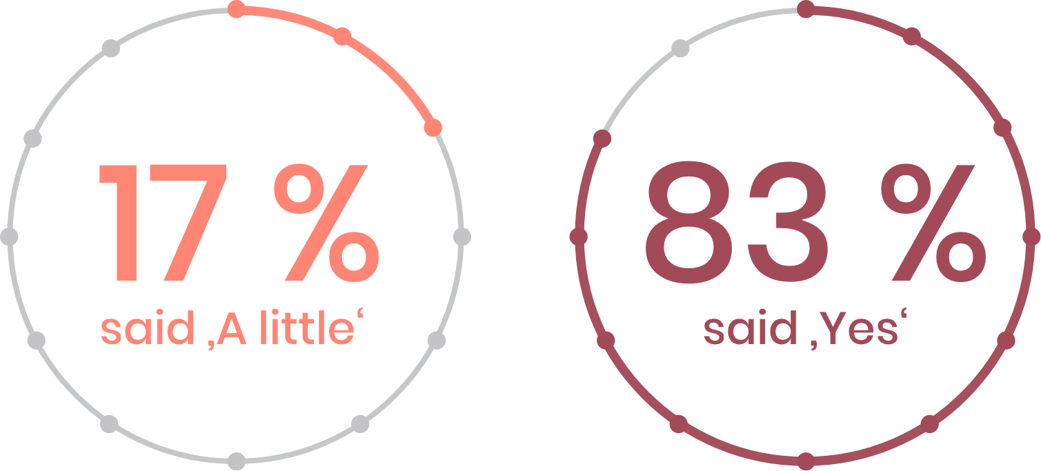
Analytical thinking.
Define and illustrate the experience.
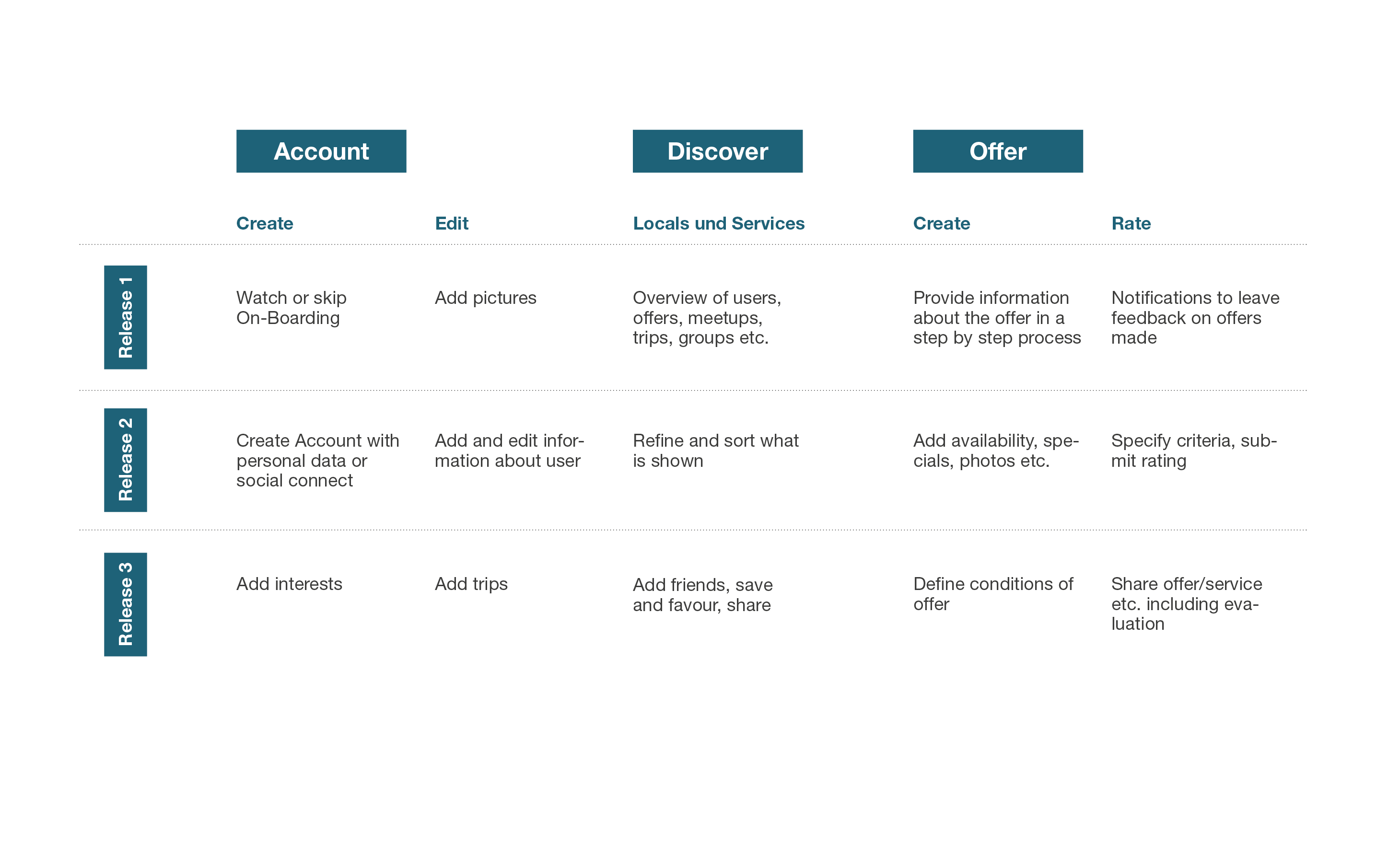
Processes and releases
After using customer journeys to examine the actual state and first possible functions a story mapping of possible functional processes was created to give hints on which features have to be incorporated into the application.
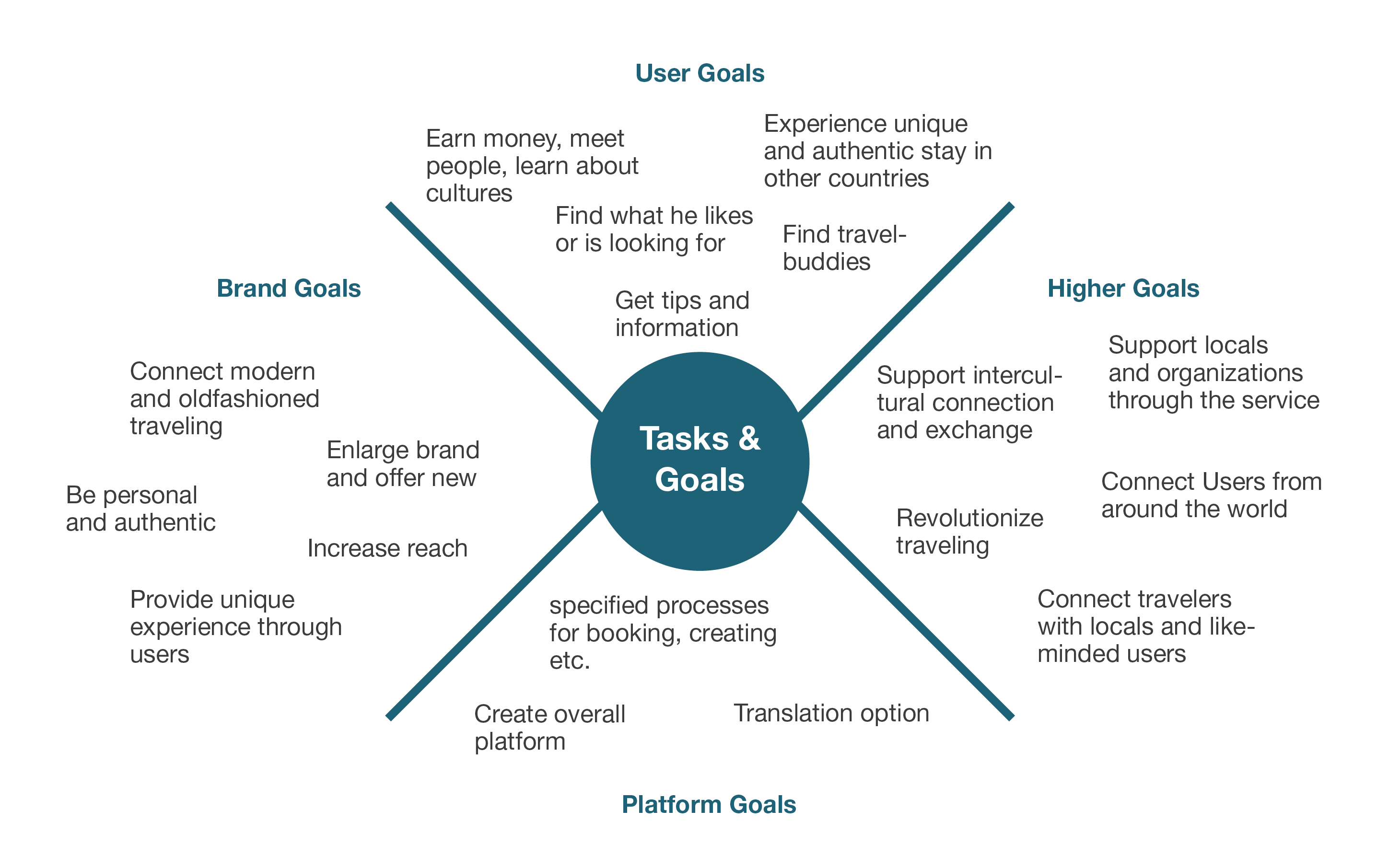
Goals and tasks
With a look at different topics such as traveling and intercultural communication as well as various analyzes goals and tasks have been defined in order to be able to include the results of the research within the app.
From traveler to local
This graphic was created to illustrate the split of the app in two different modes, as well as the interaction of different users. Both user groups can change their roles as well as the applications' modes at any time.
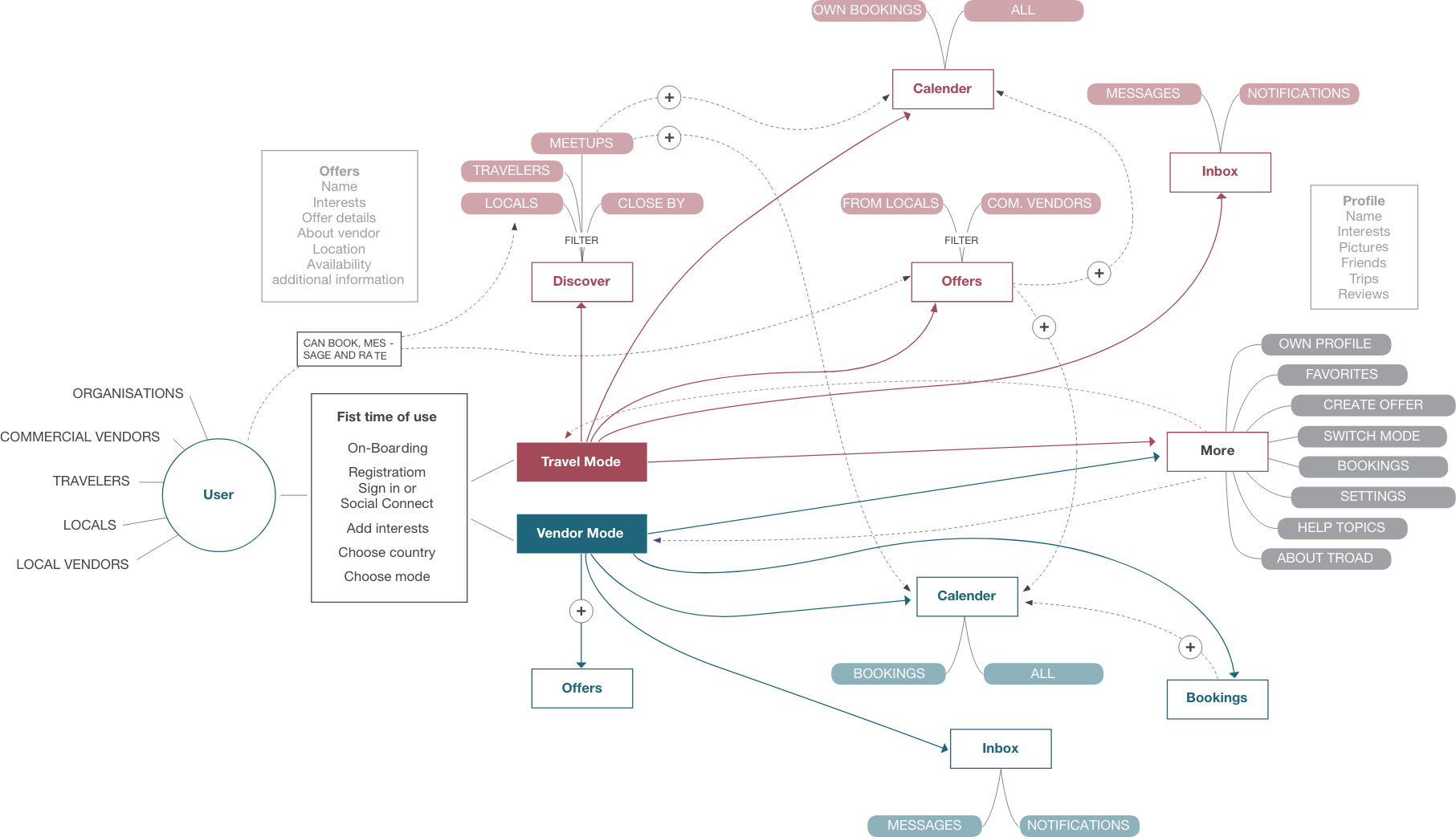
Siteformula
To get an overview of every site, their connections and features the site formula was created. It also displays both sides of the application.
From UX to UI.
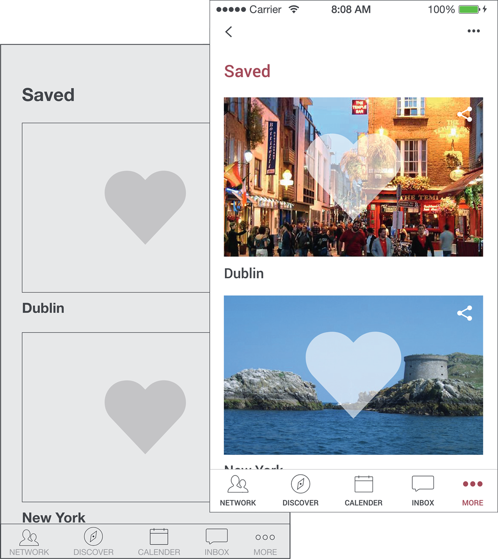
Wireframing the experiences.
Developing the Corporate Design.
The CD as the brands ambassador.
The Logo consists of two parts, the word ‚Troad“‘ which is a blend of the words ‚travel‘ and ‚abroad‘, and the achemically sign for ‚Air‘. It is used as the ‚a‘ in the logotype and as a symbol for unlimited possibilities.

Color Scheme
For the interface four strong main colors as well as different gradations were specified. The different colors help differentiate the two application modes.

#a54d58

#f18877

#1e6278

#62c1c2
Visualizing the concept.
Troads key features in an overview.
Be a traveler, local and vendor.
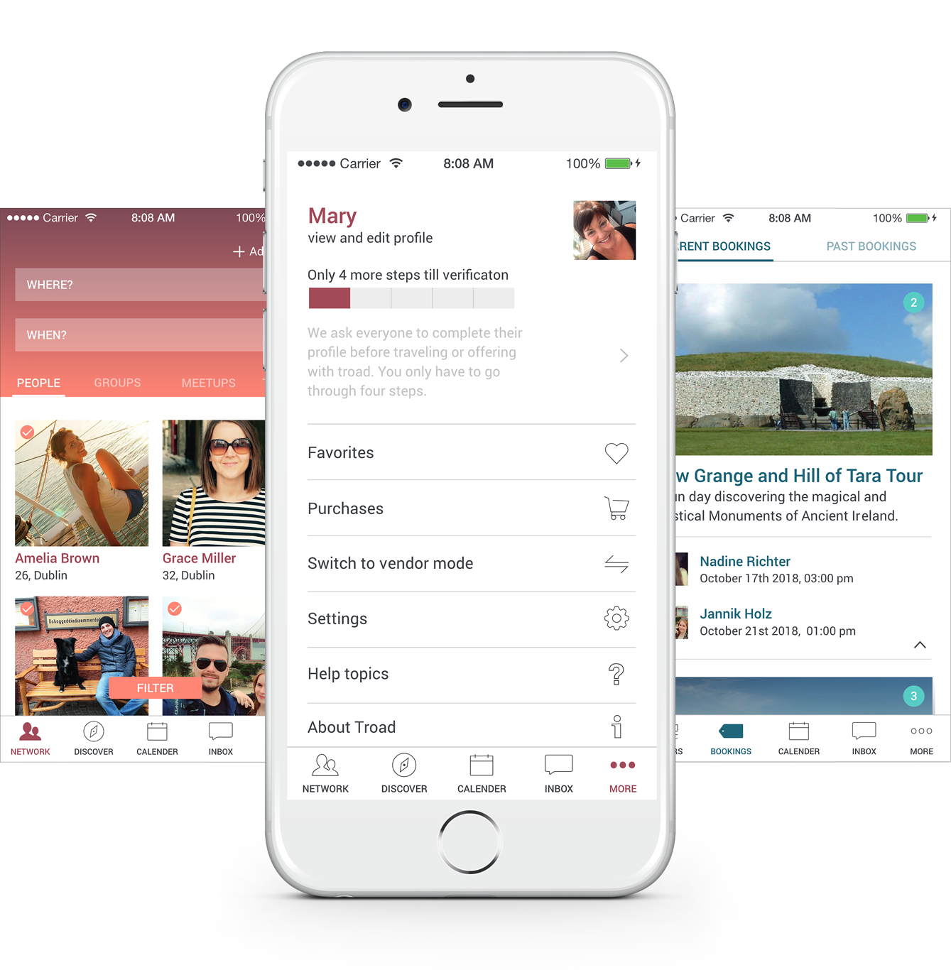
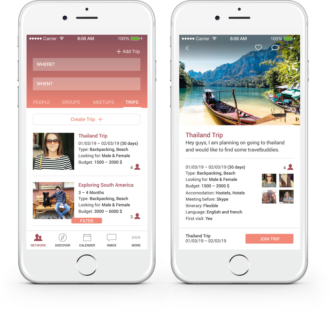
In order to be able to create a holistic digital experience, the app has been divided into two areas as described above. The travel mode offers a network and the chance to find travel partners, insider tips of other users or local offers. Within the vendor mode, the user can become a vendor himself and offer his time, skills or service, whether its a private or commercial service. The user can also find more options such as an overview of bookings and purchases within the more menu.
Combining a network with local offers.
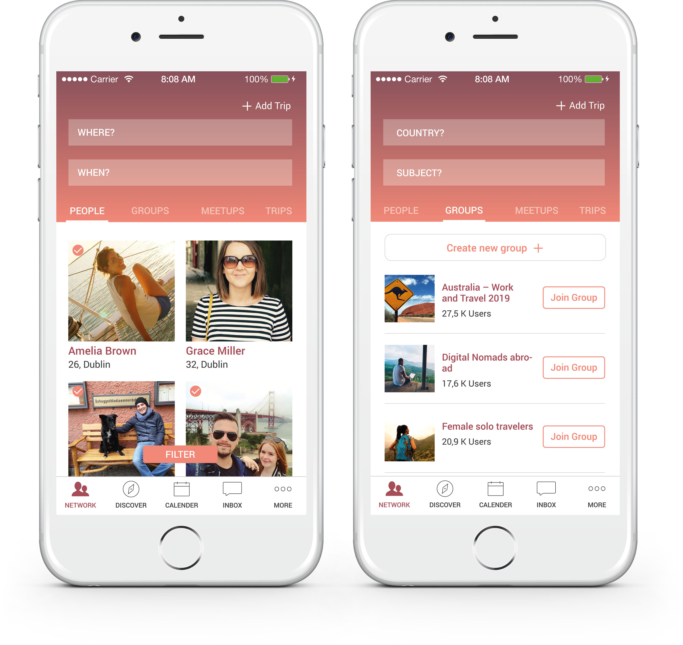
The network
Within the network the user can find other likeminded travelers and locals. He can add newfound friends, follow their journey and chat with them.
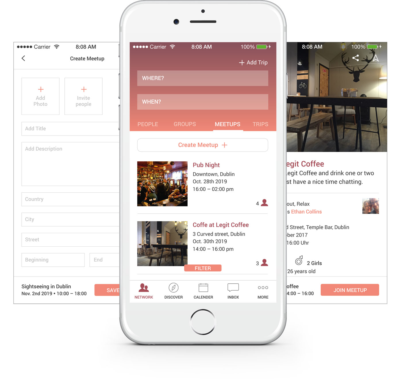
Join and create meetups
What would traveling be without meeting new friends. Therefor the user can add or join events and meetups within the meetups section.
Find your travelbuddy
Sometimes a journey is more fun if you have a travel buddy. Within the Trips section the user can add his planned trip as well as his plans and costs and others can join this trip.
Unique experiences and easy bookings.
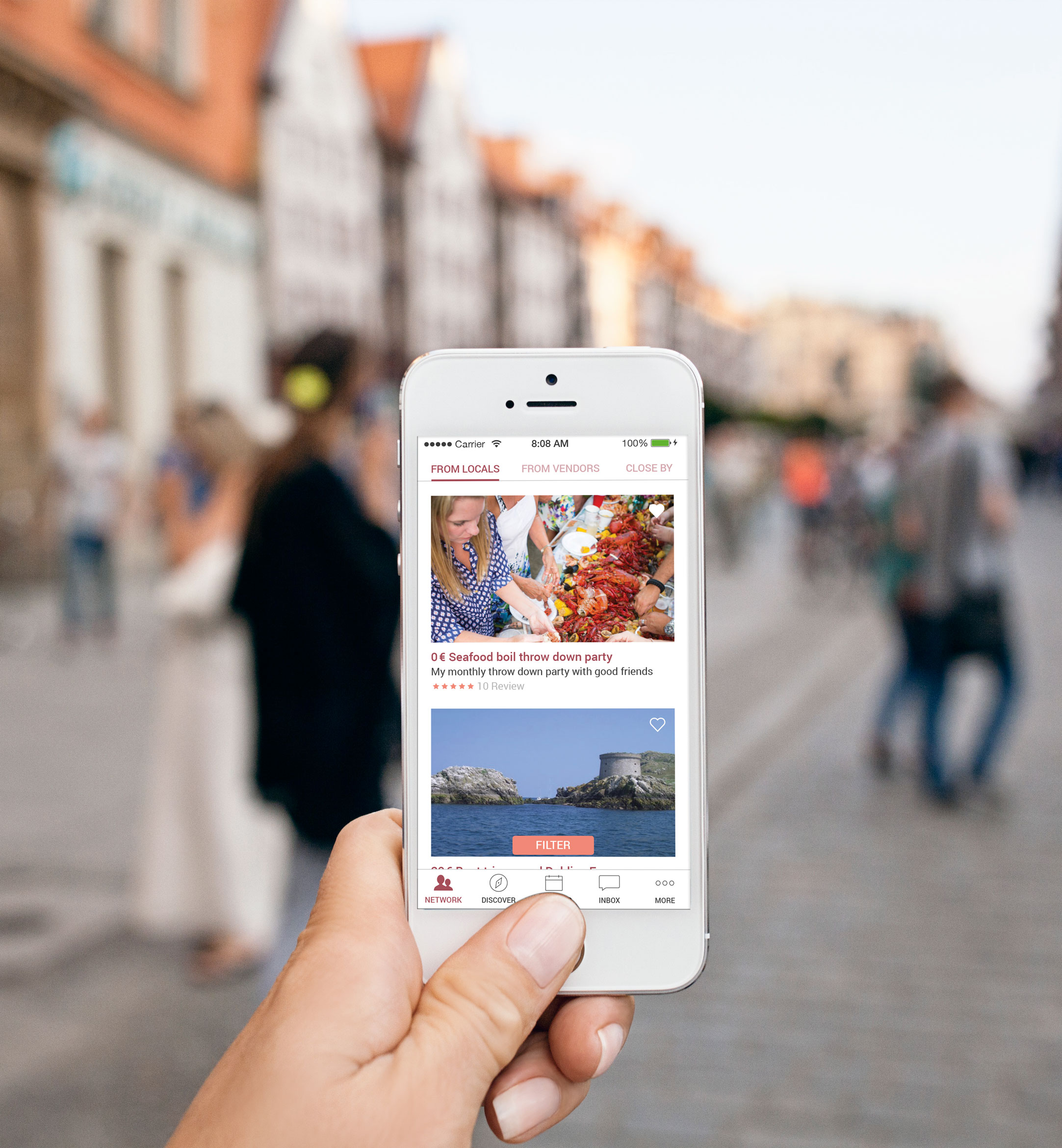
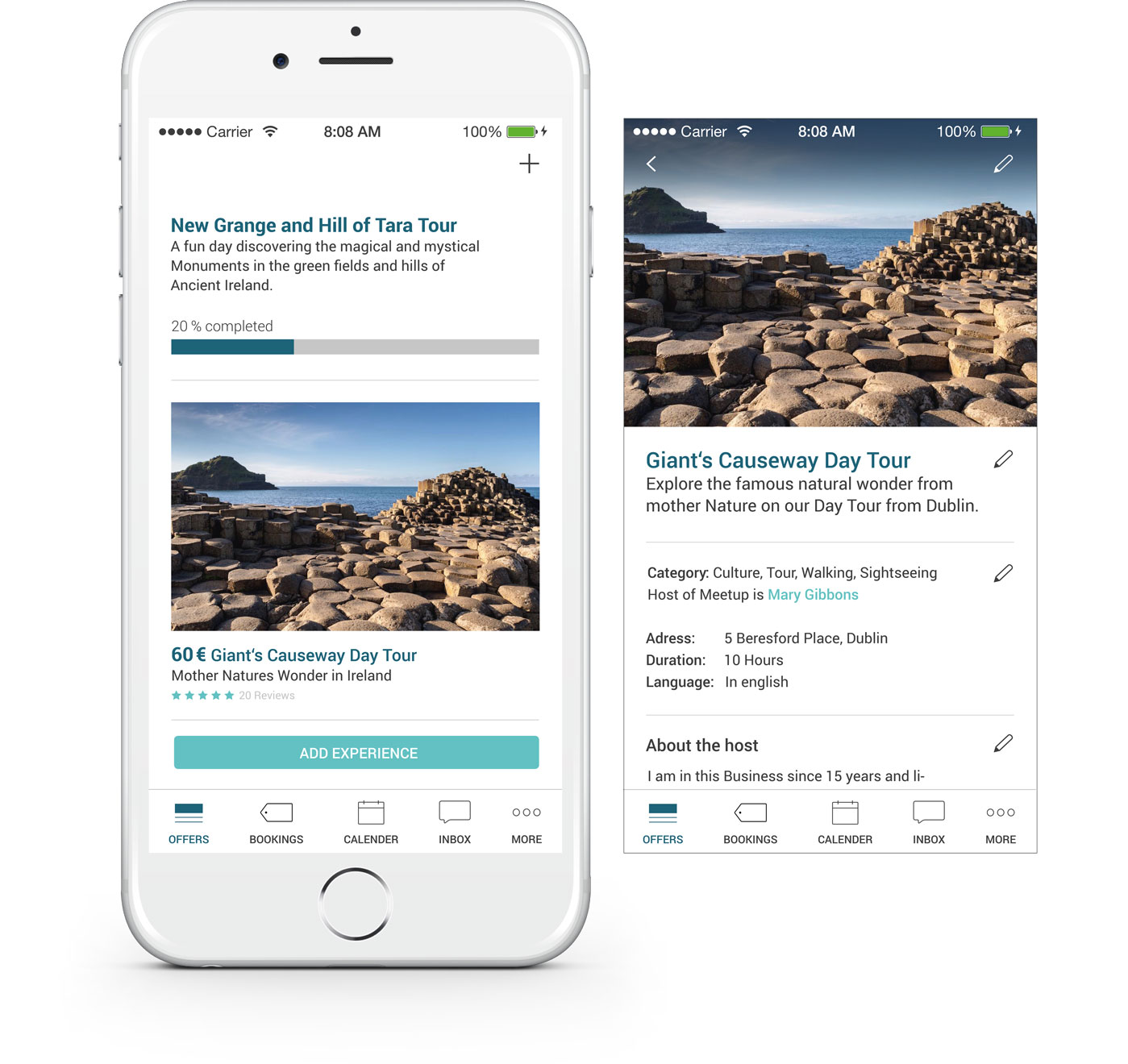
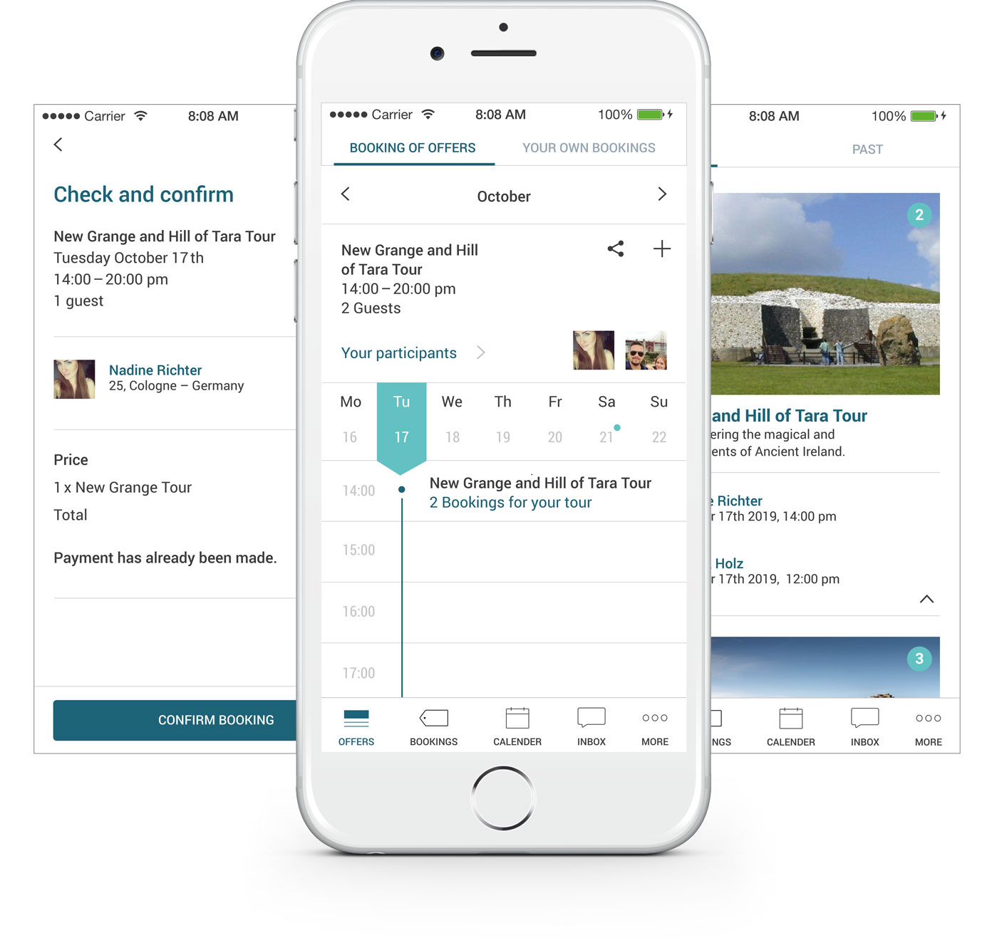
The user can explore their destination by booking free or paid tours, services or activities offered by locals or local and commercial vendors. Here he can find real experiences, like a local throwing a party and inviting international guests through Troad. Or maybe someone owns a boat and would like some company, so the traveler can book this experience and join the local vendor. The actual booking process is kept really easy with step by step guidance.
Create and manage your offers as vendor.
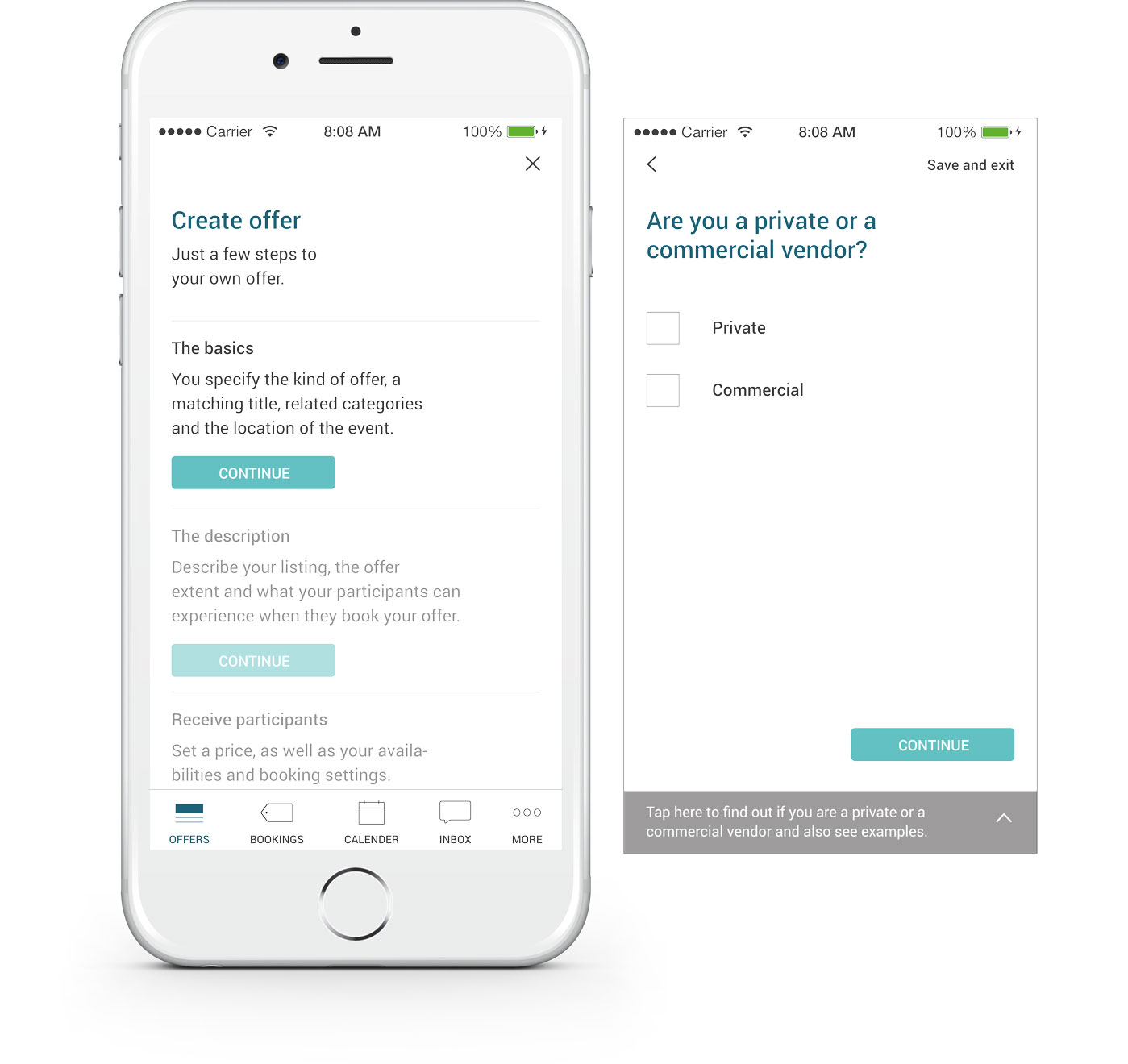
Within the vendor mode the user can manage all the services he offers, edit and update them and also add new ones. With easy step by step instructions an offer can be created in no time. If the user needs help to fill in the fields, there is always a help section with examples. As a vendor you also have to keep track of all the bookings made. Therefor the vendor can find an overview of bookings, participants, payments and updates.
What’s next?
Diving into the market and promoting Troad.
Successful examples, such as Uber and Airbnb, show us that actually implementing this app would be the right thing to do. And because of that I am trying to find sponsors or companies that would like to take this journey with me and get this app into the market. Because in times of globalization these types of service apps, which also don’t need any kind of material resources will become more attractive and important to society.
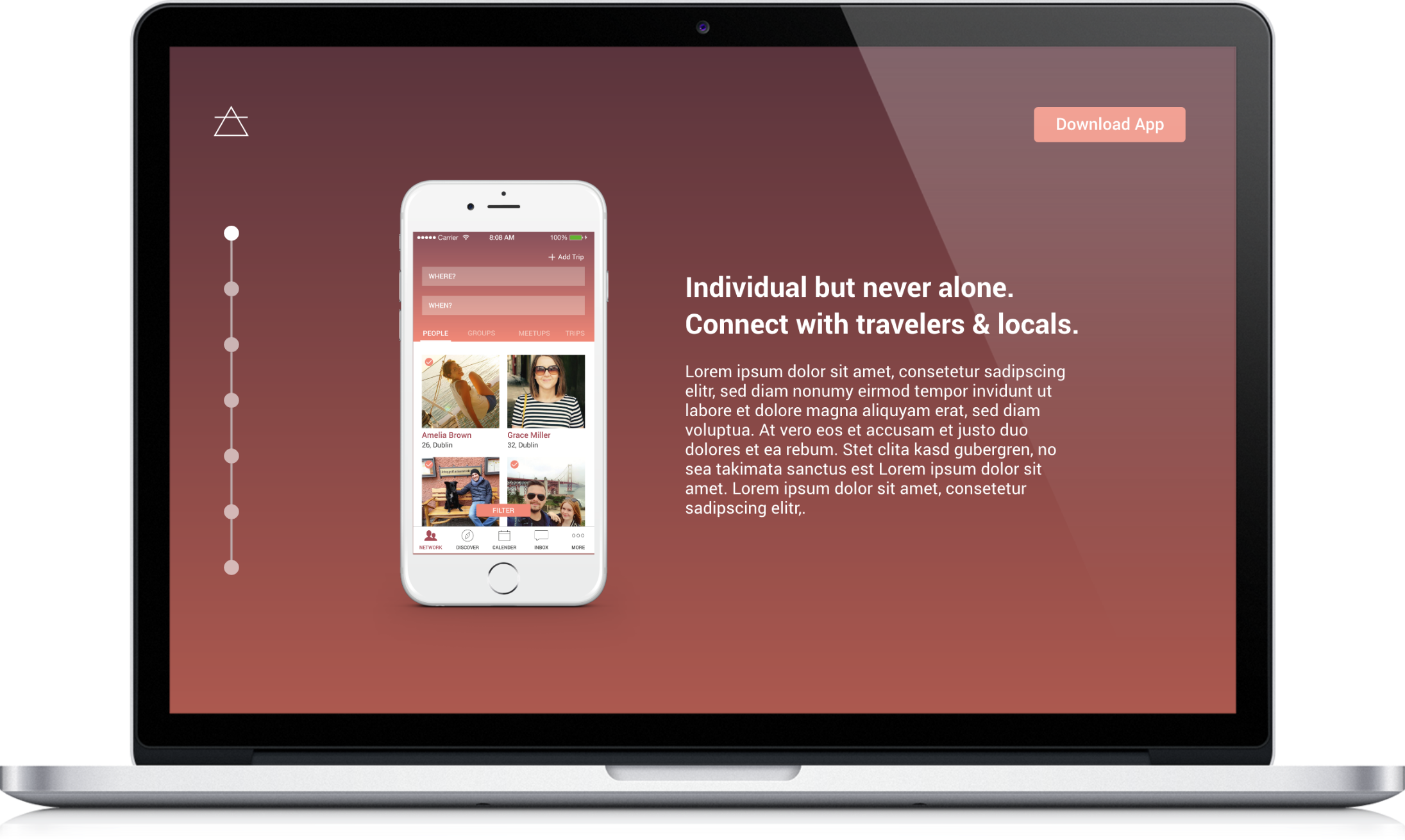
A design of the marketing still needs to be done since it takes a crucial role in the realization of the application. Therefor potential users could be reached through targeted advertising on social networks, travel websites and also with influencer marketing. Besides that, it would be possible to address individual vendors and inform them about the app.
In addition, poster campaigns would be conceivable, and an informational landing page indispensable.
Furthermore, new features and extensions are already being considered such as a dahsboard with suggestions or working opportunities.
