Tyro website redesign

As part of Tyro’s continued growth and expansion, they were looking for a redesign of their website to align with the rebrand ‘Better Business Banking’.

Go directly to:

01_Tyro_Keyvisuel

Tyro Website Redesign

As part of Tyro’s continued growth and expansion, they were looking for a redesign of their website to align with the rebrand ‘Better Business Banking’.

A website as shopfront.

A fundamental component of the rebrand.

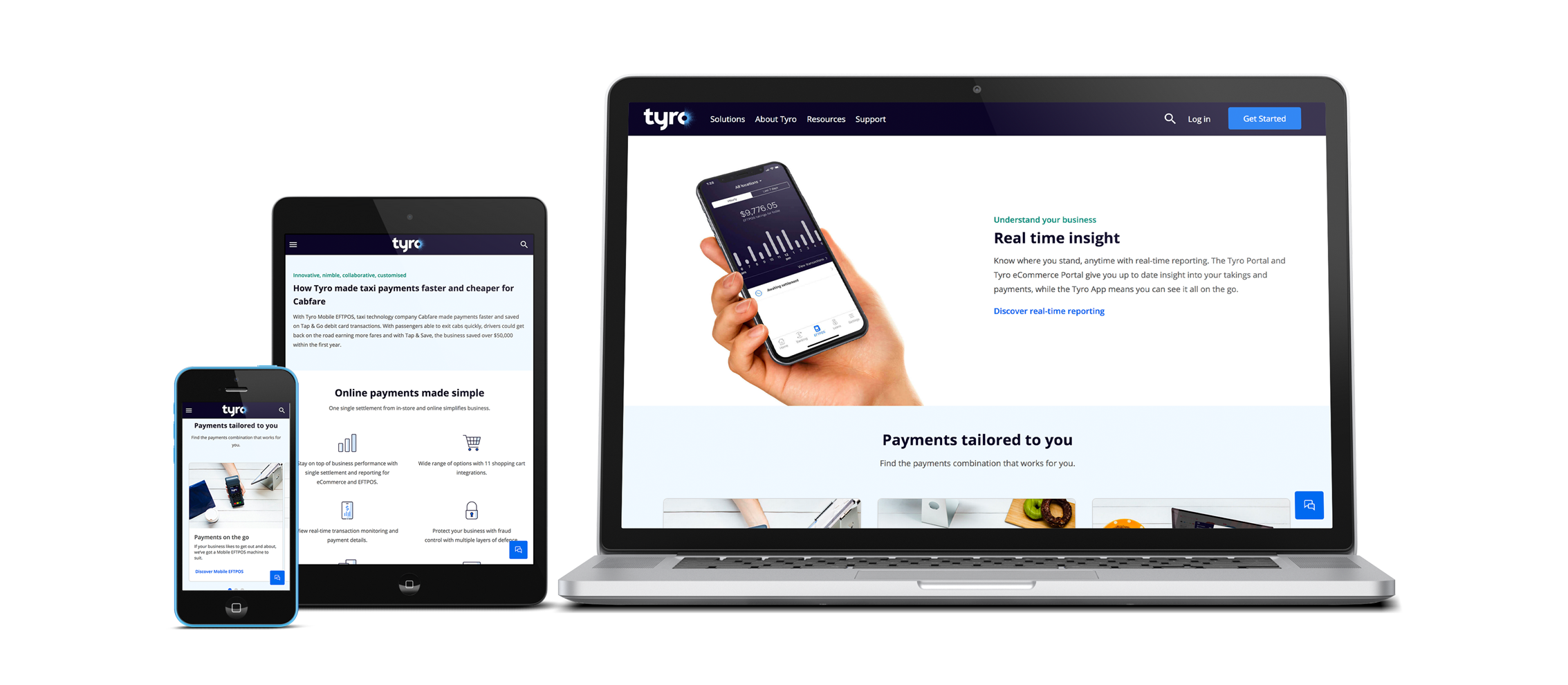
Launched in 2003, Tyro is Australia’s fifth largest payments provider, while its banking and lending products continue to grow strongly. Being a business bank built on technology, their website is their shopfront, which made the development of a new site a fundamental component of the rebrand.

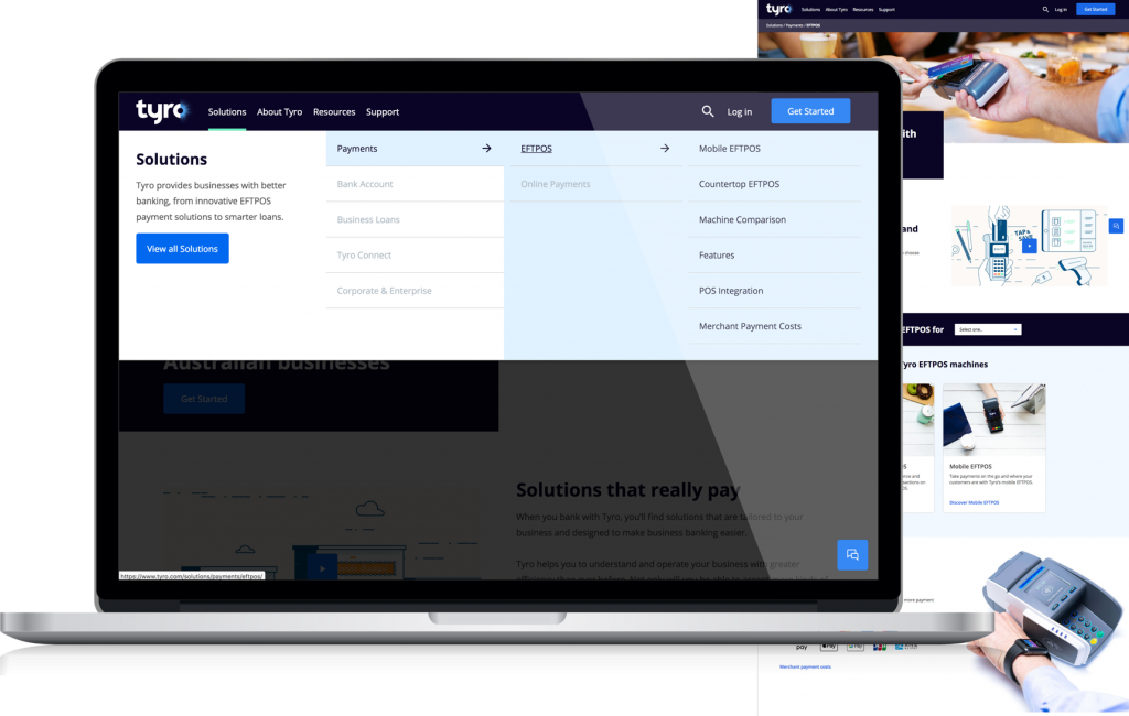
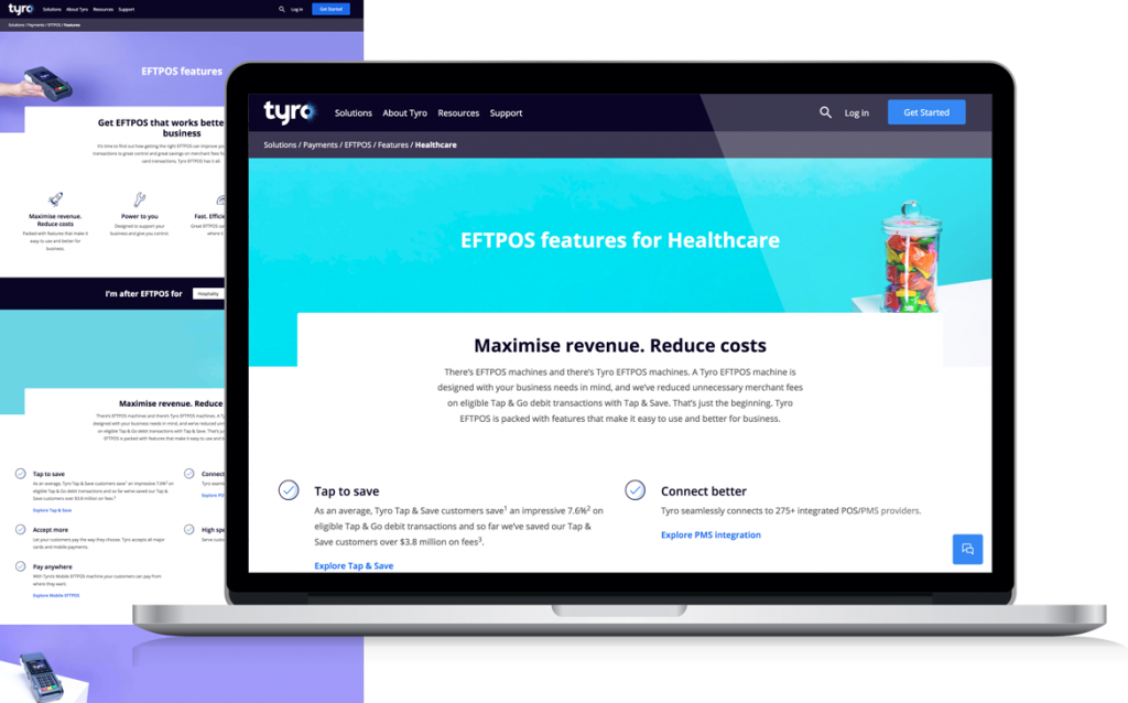
To deliver a website that balances both brand awareness and lead generation, a thorough discovery and UX phase was undertaken leading into a design that not only delivers a customer-centric website, but also captures the essence of the new tagline of ‘Better business banking’ across the site while maintaining the focus on generating leads.

Client

Tyro Payments Limited

Role

UX & UI Designer

Deliverables

Website, informational spreadsheets

Timeline

Approx. 6 months & improvement plan for a 2nd Phase

New innovative products.

Setting redesign goals to achieve business objectives.

Following a kick-off meeting the top 3 goals for the new website were captured. When I jumped into the project a lot of research within the discovery phase was already done. The team had a look into target groups, did a market scan as well as a review of the current website. The approach to the redesign was to break the website down into 8 main templates with several components to create every single page of the website.

Generate and convert leads

To achieve this we constantly kept in mind what we had found out with the website review and market report. This led us to the conclusion that it was way more difficult for users to get a quote or to buy a product or a service than it had to be.

Customer centric UX

Creating something that is what we think it should be like is not the right approach. Which is why we used findings from Personas and Segmentation analytics reports, to create an end-to-end journey, including both offline and online activities.

Simple, scalable and personalised

Applying atomic design principles made it easier to develop the website and made it easy to scale. A personalised experience was another big goal, that we implemented through customer log-ins and business queries to target the right content for different audiences.

Sketching workshops to gain more insights.

Whitegrey conducted multiple collaborative sketching workshops with the staff of whitegrey and Tyro to sketch out key areas of the site. Inviting staff from different positions and backgrounds within the Tyro company, helped to understand what aspects are most important and what Tyro itself expects from the redesign.

Outlining site content and structure.

Components made reusable with atomic design.

The goal was to create several components for 8 templates that could be reused throughout the website. To achieve this, the atomic design approach was used. We started with small elements like buttons and combined those atoms to create molecules and later on the organisms. All used components (organisms) needed to serve a purpose. Due to this approach everything was scalable, consistent and easier to handle for development.

Agile methodologies.

Using the scrum framework to iterate on the go.

For effective team collaboration and for working closely together with the client, we used principles of the Scrum framework. For our Product backlog we used Jira’s Kanban boards and offline boards. The sprint planning started at the beginning of the project to get a rough roadmap to start with and the planned scope was revised and adapted every two weeks. The actual sprints were mostly two weeks long. With short daily Stand Ups including the team and the client, everyone had the time to voice any concerns or blockers and to get everyone on the same page. At the end of every sprint, the team and stakeholders got together to review the increment, to gather feedback and to talk about the goals of the next sprint.

Designing the interface.

With all the organisms and wireframe templates we had build, it was time to design the interface. The website had to be aligned with the new rebrand and the stakeholder expectations. By showing Tyro appropriate images, videos and texts, they learned what kind of content they still had to produce.

What can Tyro actually do for me?

Tyro’s homepage was redesigned to introduce Tyro as a bank, inform the user about Tyro and its benefits, its products and how it could help the user’s business.

Leading the user through Tyro’s products.

For Tyro’s products we introduced a 3 to 4-step approach (depending on the content), leading the user from the first to the last page to get a deeper understanding and more in depth information about products and services. Business queries were included to target the right content for different audiences. ​

Tailored to the customer’s needs.

The business query is also a part of the more detailed pages like features. If the user chose a business within those pages or before on the product page, only those information important to his kind of business will be displayed. This helps to personalize the website and to give useful information instead of showing everything, that might not even be a part of the solution for the customer’s business.

Handing over a project.

The first steps to creating a design system.

The client Tyro played a big role in all the phases of creating this website and gained a lot of insights and understanding of everything that was designed. To make it easier for the client to work with everything delivered a Guideline was created.

Component Spreadsheet

To make development easier a component spreadsheet was created. It shows all used components, their placements, interactions, properties and optional elements. This spreadsheet was also used to create a guideline for the client.

Template Spreadsheet

Since WhiteGrey only designed 8 Templates to fit all pages, a spreadsheet was created to give the client a guideline of all pages, their matching templates as well as their mandatory and optional components. This makes it easier to keep a consistent look and feel throughout similiar pages and contents.

Styleguide & Pattern library

All the components with their use and style, were translated into a pattern library for easier development as well as for creating another part of the guideline. Together with the global style like fonts they were summarized into a Styleguide and Pattern library.

The Quote Wizard

The redesign of the wizard was an important part of the website to generate and convert leads. With the redesign, we planned to overcome the Bounce-Rate by leading the user through a process of creating his personalized product combination and a quote summary.

Testing & Planning

Test and go-live in two phases.

After finalizing the designs and contents whiteGREY co-ordinated and prepared full requirement testings and a User Acceptance Testing. With the two-phases of going-live additional features and planned updates were prepared and scheduled.